
Unveiling the Integrated Sexual Reproductive Health and Rights program Identity
Thursday, 15 April, 2021

The Integrated Sexual Reporductive Health and Rights program is to be implemented under a partnership of three other organisations , as a partnership we felt the need to stand out from the normal organizational identity and create an identity for this 4 year program.
As partners we came together with our beneficiaries and brain stormed on what makes the program different from the many in the space, what the program will stand for and how we view our selves and where we see our selves in future. ie deliverables.
Using insight and intuition we extracted concepts, key words, symbols, icons, visual language , colors for each impression created. Our thinking was adventurous bearing in mind our key target groups. We tested different and new formats of tag lines, colors and images using psychological guides on shape, color, type and wording.
We generated a number of ideas, presented them to different segments to be reviewed , critiqued , appreciated and approved in joint team work.
In the whole process we had to consider various aspects like age group, colors that suite our program goal. Through the Communications team lead of each partner, reviewed the Program document to further appreciated the program and lay out a clear strategy to develop a Program Logo, name, Tag line , Color and Hash tag.
Our strategy involved collaboration between the program staff, beneficiaries, designers and other essential partners in the districts of implementation.
The Communications team set out a clear purpose for the framework on which to build our log, looking at specific program deliverables and target groups.
In the process we engaged various persons to share their perspective. The program teams guided Practicability of how the Program identity will be rolled out and used. We also considered our completion and what is already on the market / space.
All the five elements of the process i.e. logo, color, tag line, program name and Hash tag went through a short listing process , judgments , feedback processes and Refinement to enable us have the final logo below.
The Hash tag is #Heroes4GTA and the colors; white for equity, Orange for eliminating Gender based violence, black for the African continent and green for Health interventions.
Check out the beautiful work of a dedicated team. Team work is Dream work.
Amref Health Africa teams up with African communities to create lasting health change.
Latest News
-
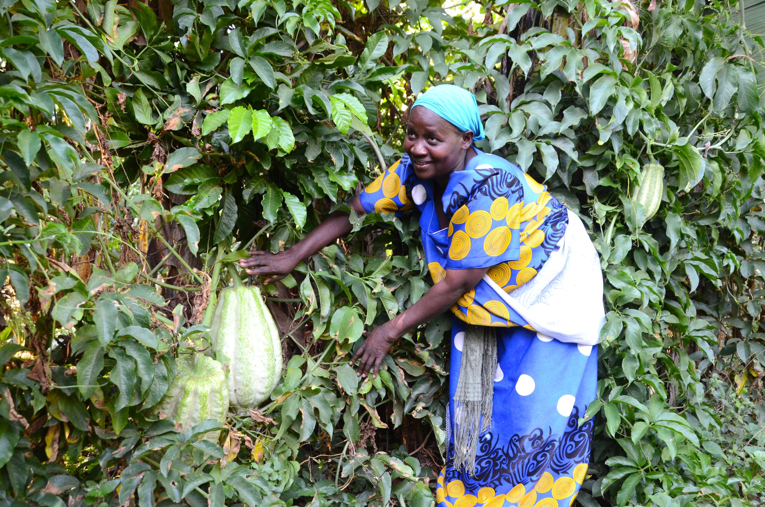 Oyster Nut Farming as a Pathway to Better Health and Economic Empowerment in Bugiri & Mayuge districts.
-
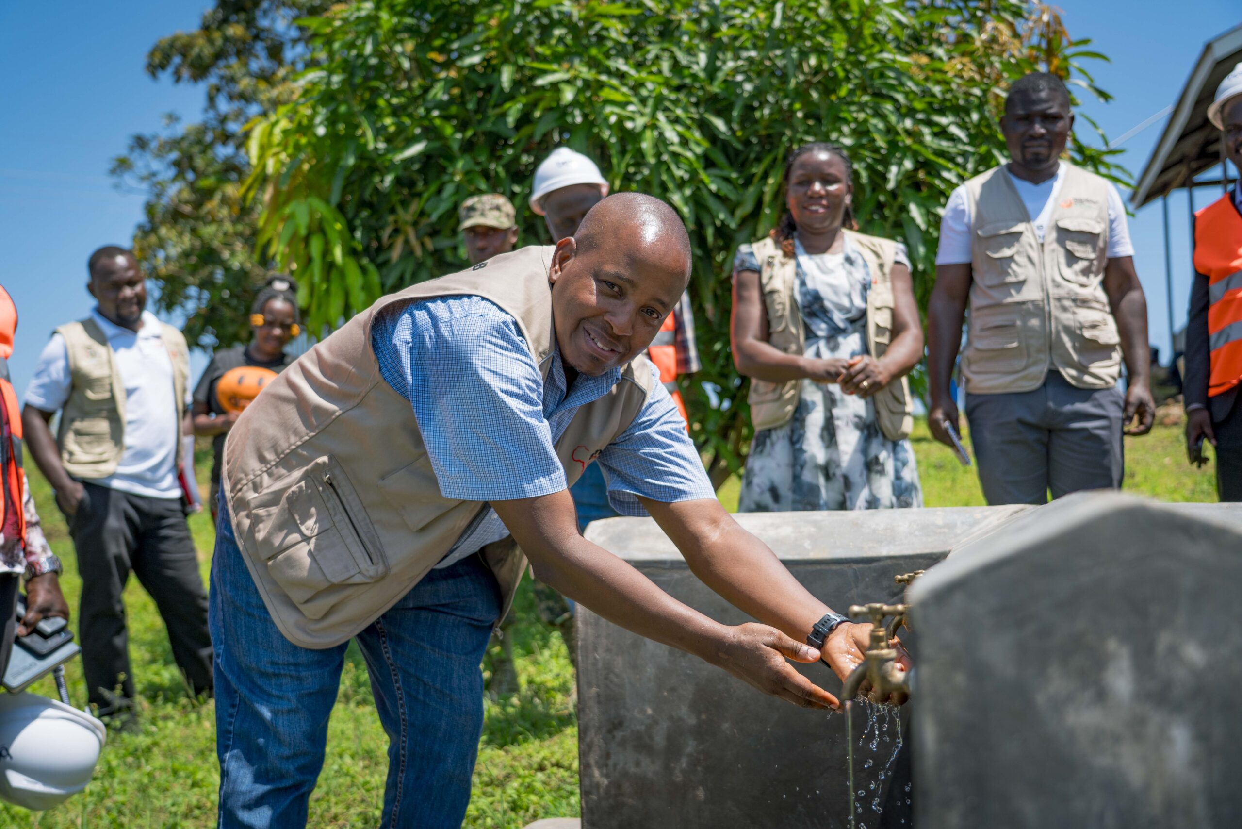 New Water System and Sanitation Facilities Benefit Kalangala Communities.
-
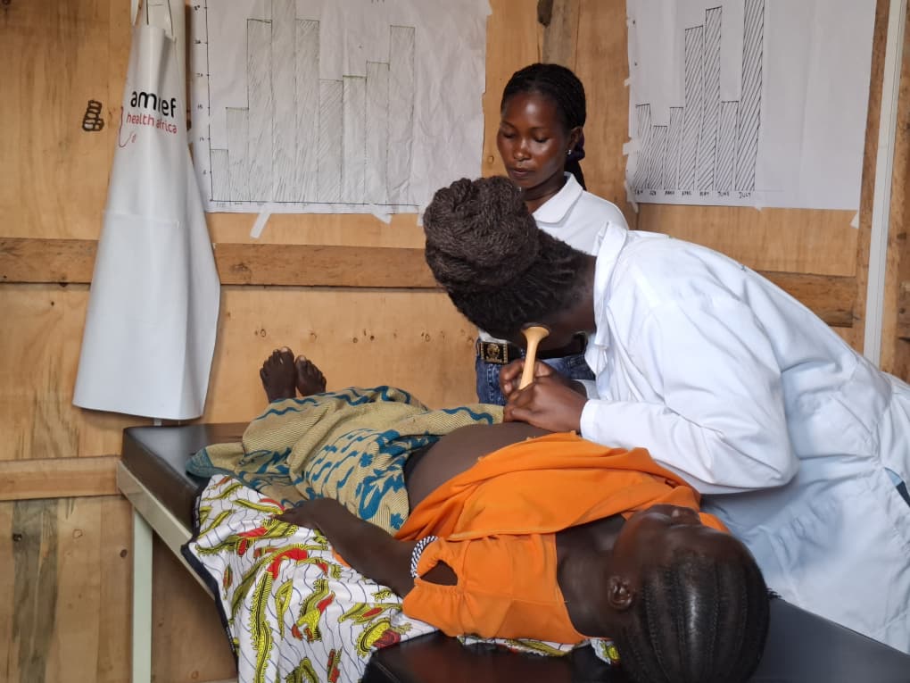 When Systems Are Strained, Communities Still Matter: How Amref Uganda Sustains Care amid Challenging Times.
-
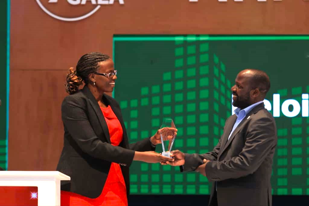 Amref Uganda’s Finance Manager Wins Prestigious 2025 CFO Award.